Mazda: Build & Price Tool

Developing a more intuitive user journey and minimizing identified pain points


Overview

Mazda’s Build & Price tool allows users to customize a vehicle around their individual needs and preferences, but research revealed several points of friction within the experience. Using insights from in-depth user research, I identified the most significant pain points and designed targeted solutions to simplify the journey, reduce friction, and create a more intuitive path to building the right vehicle.

Role UX/ UI Design

Challenges Developing a balance between options and ease of use

KPIs Conversion, drop off rate, CTR


User Research, Visual Design, Prototyping


The Looping Experience

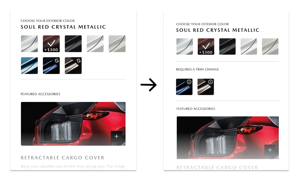
The current flow allowed users to choose selections that would not be available at their trim level, forcing the user to have to return to the start and reselect a viable option. This lead to frustration and a high bounce rate. We determined that 85% of car buyers rated color an extremely important part of the car buying process so we focused on addressing the exterior color issue first.


Solutions

One solution to deter bounce rate was to display only available colors at the trim level instead of having to build out the entire vehicle only to find that the color choice isnt viable at the end.


The Icon Issue

We also flagged the use of the ‘change’ icon that was being used and noted that participants were unclear of its’ meaning and were also missing the icon all together. My solution for this was to first, change the icon all together to give more information and also add a subsection to emphasize the user’s choice.


Next
Next

Centralizing the College Application Process