Mattel: Improving Product Evaluation for High-Intent Shoppers
Overview
Product imagery plays a critical role in helping shoppers understand, evaluate, and connect with a product before purchase. For Mattel’s desktop PDP experience, we identified an opportunity to give imagery greater prominence and make better use of the larger screen space.
I redesigned key elements of the desktop PDP to heighten the visibility and impact of product photography while maintaining access to essential product information and purchase actions. The goal was to create a more immersive product experience that helped dedicated shoppers explore products with greater confidence and ultimately move more seamlessly toward conversion.
Role UX/ UI Design
Challenges Working within an established ecosystem on desktop on
KPIs ATC on PDP, CVR, Product Engagement Rate
User Research, Visual Design, Prototyping, Development
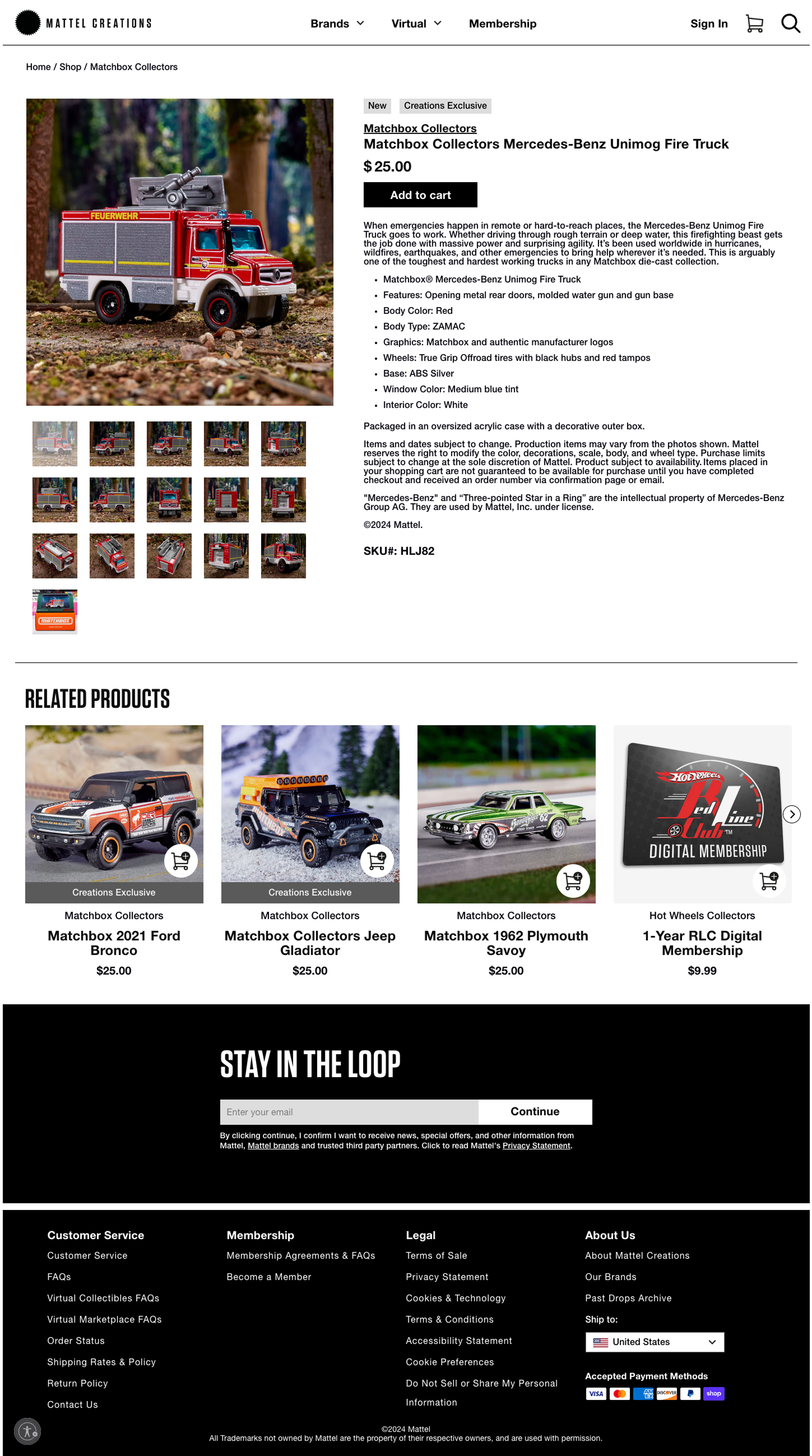
Original PDP Designs
While the majority of our users come from mobile, our desktop users actually convert higher and this test was specifically directed at those users and optimizing their experiences.
Originally, we had thumbs placed below the main image with the majority of the page real estate being used by the text.
Unexpected Insights
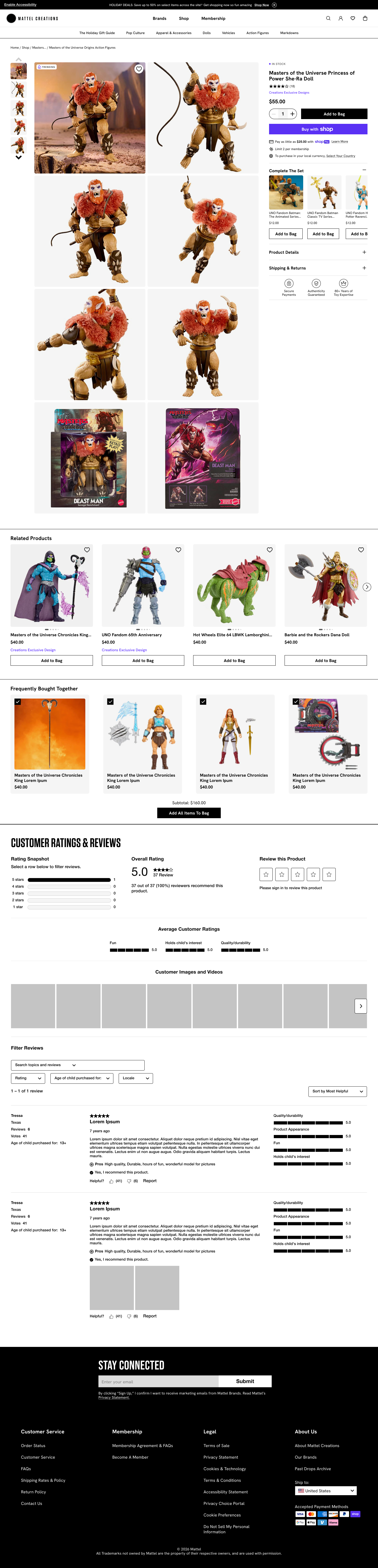
Optimized PDP Designs
Through many rounds of user testing and ideations, we were able to define that our users respond to large imagery and the copy is less important. From there were reimagined the PDP page to emphasize the imagery and descope the copy, only highlighting conversion.
While the redesign focused on increasing the visibility of product imagery, testing revealed that adding more imagery above the Frequently Bought Together carousel actually decreased conversion downstream. This unexpected finding challenged our assumption that more visual content would always improve engagement and helped us identify where imagery added value—and where it introduced unnecessary friction.